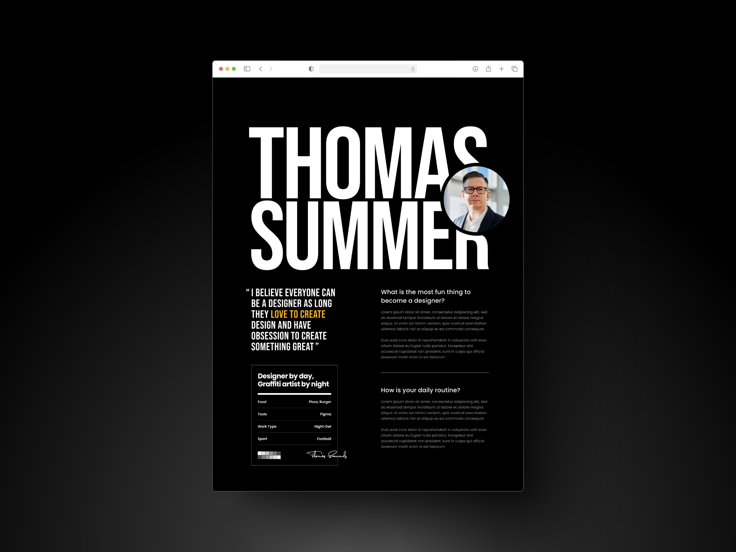
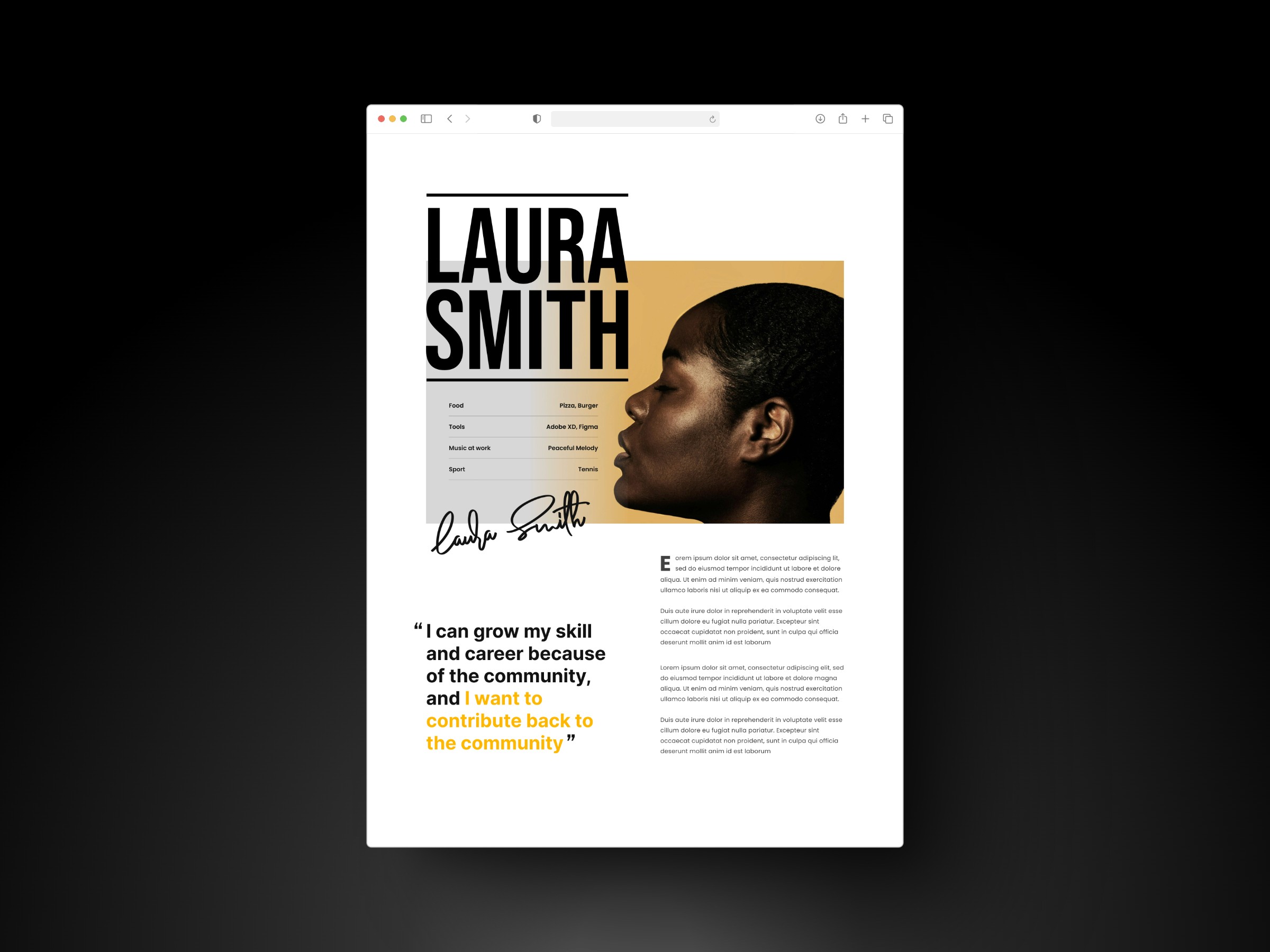
this poster design project focuses on creating a visually striking yet minimalistic composition that effectively conveys key information. it emphasizes clean typography, balanced layouts, and strategic color use to enhance readability and engagement.
the challenge
a cluttered poster loses impact. the challenge was to create a design that grabs attention while keeping the message clear and easy to read. minimalism, strong typography, and a well-structured layout were key to achieving this balance.
the solution
the design focused on minimalism for clarity, using bold typography for readability and a limited color palette for emphasis. a structured visual hierarchy guided the viewer’s eye, making key information easy to grasp at a glance.
key outcomes
the final design balanced simplicity with impact. minimalism enhanced readability, while strategic typography and colour guided attention. a strong hierarchy ensured clear communication with a visually compelling presence.